
The challenge was ensuring that the deeply human, psychologically grounded strategy I had created translated into a clear, trustworthy and resonant brand expression. When strategy becomes sophisticated and emotionally rich, it’s inherently vulnerable to oversimplification or a reduction to surface level design during execution.
What needed protecting was meaning itself; the emotional intent, cognitive clarity, and strategic direction at the precise point where strategy becomes vulnerable to creative dilution. That necessity is what forced the work to become structured.
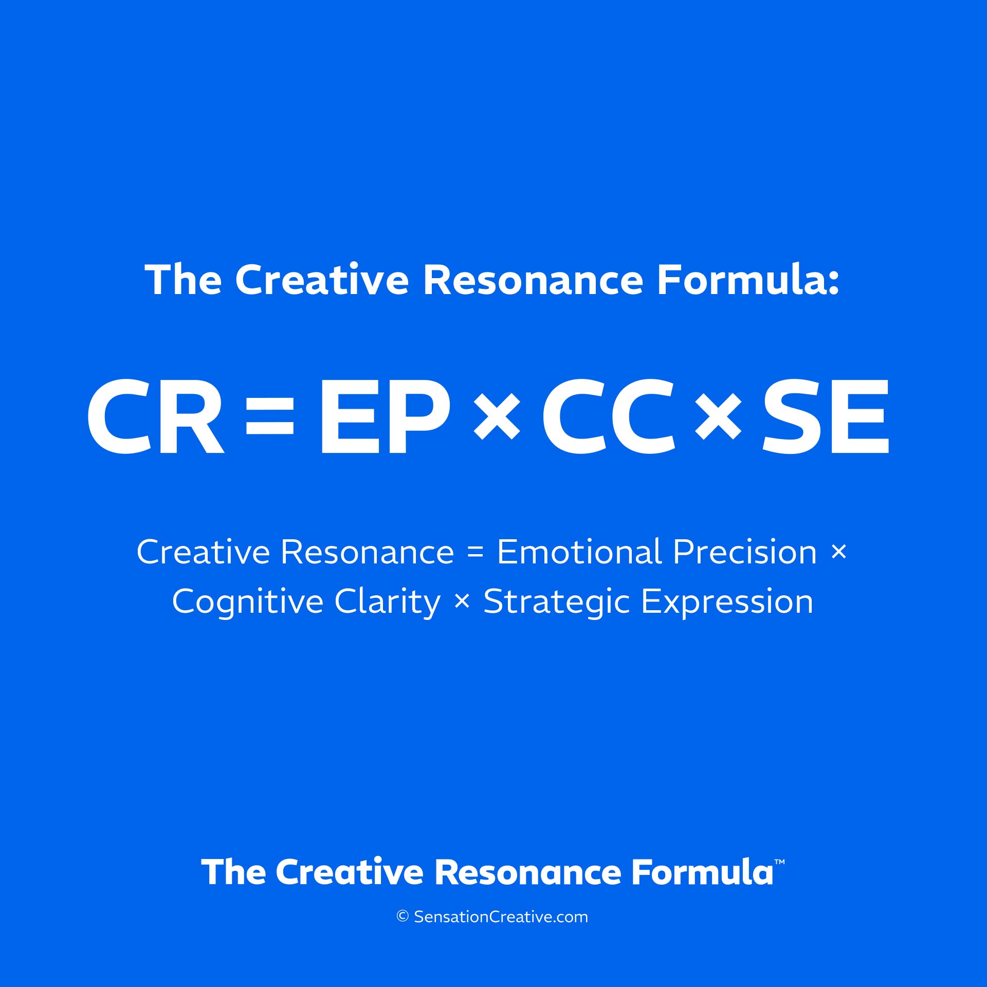
It was this need, to protect meaning at every critical point, that shaped the structured approach I use today. Developing the brand identity of my own agency provided a controlled opportunity to formalise and demonstrate that approach with The Creative Resonance Formula.
This is not a rebrand story. It’s a translation case study.*
*A traditional rebrand story typically documents the full process: audit, strategy, design, including the design process itself, execution and the result of the work.
To keep the case study focused, the Sensation logo is used as a clear, contained way to demonstrate The Creative Resonance Formula in action. The logo is often the first and most recognisable element of a brand identity, making it an effective reference point for showing how meaning is translated into form.
This is not to suggest that a logo is the brand. It isn’t. A logo functions as a visual shorthand, a concentrated expression of the wider brand system and everything it represents.
A brand is ultimately formed through the combined experience of many elements: visual identity, language, products, services, environments, and the people behind them. It’s the meaning and feeling that emerge from this whole, not any single asset, that define the brand.
How The Creative Resonance Formula translates strategy into design will therefore differ for every organisation. The Sensation logo is used here not as a universal template, but as a precise, legible example of the translation process at work.
Before any visual decisions were made, the intent was defined at a non visual level.
The work needed to:
The desired outcome was not simply attention, but alignment.
The emotional tone was deliberately restrained. The brand needed to feel:
High arousal emotional tones such as disruption, urgency, or provocation are present but not dominant within the messaging and overall emotional tone.
Where moments of emphasis or focus are needed, they are applied deliberately and in alignment with emotional intent, ensuring impact without disrupting the carefully defined emotional tone.
This precision ensures the brand speaks to how SME leaders actually feel when making high stakes branding decisions, rather than how typical small branding agencies like to present themselves.
Claims such as ‘human focused branding’ are common and often vague. If the meaning behind the brand could not be immediately recognised and felt, it would collapse into abstraction.
The cognitive task was therefore to reduce interpretive effort:
This led to disciplined decisions, from the original naming to simplicity of form and visual restraint. Every element had to reinforce recognition and understanding, not invite over interpretation or debate.
Clarity was treated as a strategic requirement, not a stylistic preference.
With emotional intent and cognitive requirements clearly defined, design execution becomes a process of consequence rather than creativity alone.
By this I mean that brands are experienced through the same sensory and perceptual processes people use to form meaning. A brand is encountered visually, audibly, verbally or through lived interaction across multiple senses and over time, while meaning is actively constructed in the brain from those signals.
This initial sensory engagement provides the conditions for awareness, recognition, emotional connection, and strategic alignment to emerge.
Each design decision was treated as an expression of intent, not simply a matter of taste.
The Sensation logo was designed as a direct expression of how meaning emerges through lived experience.
Rather than acting as a decorative mark, it encodes an experiential journey that mirrors the process The Creative Resonance Formula is designed to protect; from initial sensory experience, through awareness, into considered action.
Let’s look at the logo design.

The Sensation Logo & Avatar on Blue
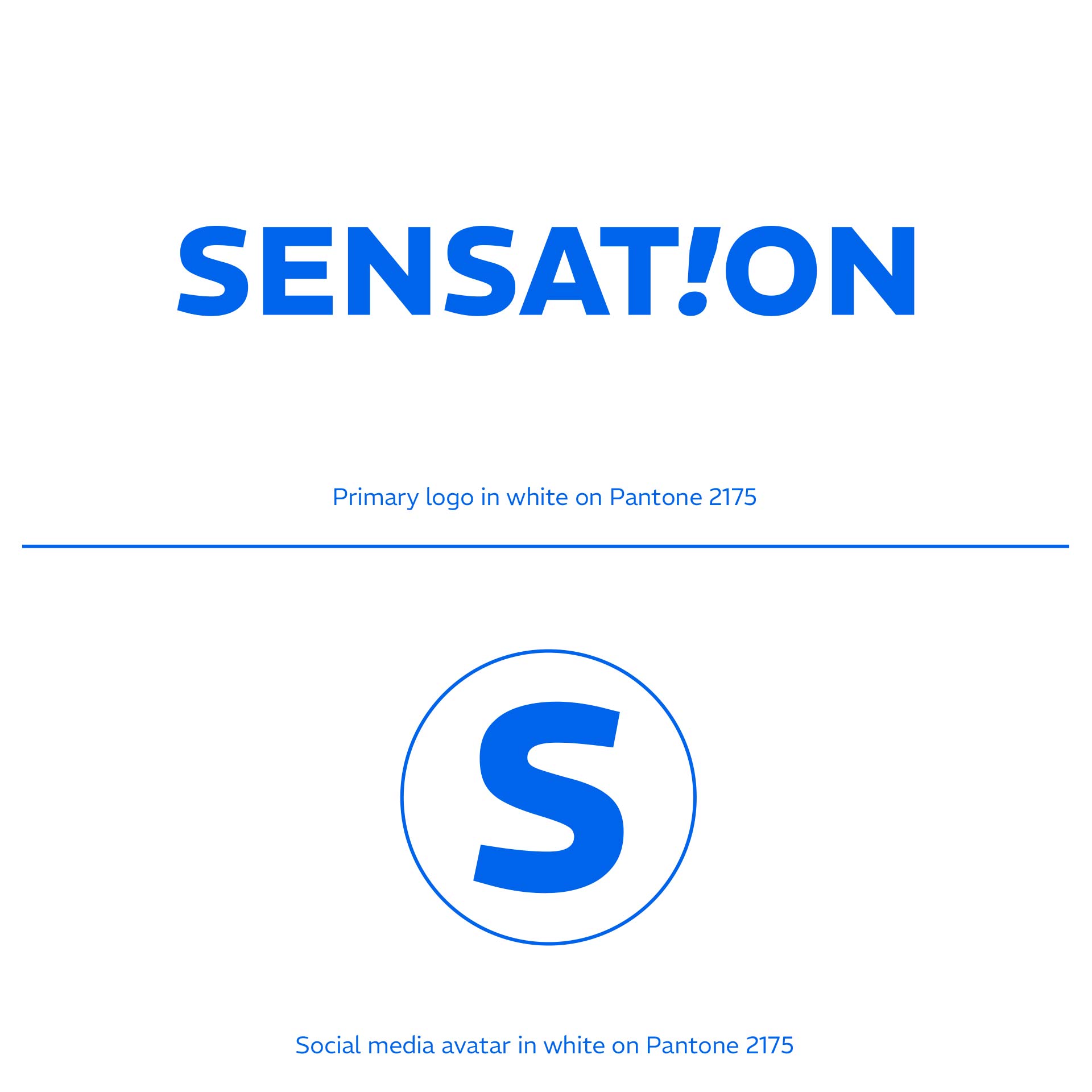
The Sensation Logo & Avatar on White

Our Senses Provide The First Moment of Human Experience
The opening element represents the first moment of human experience: when we connect with the world, and brands, through our senses.
This stage anchors the brand in the reality of lived experience rather than abstraction, reinforcing Emotional Precision by treating emotion as the raw input that’s a direct result of sensory experience.

Sensory Information Travels to The Brain, Awareness is Triggered
The italic exclamation mark replaces the letter “I” to signify the moment awareness is triggered - the instant a sensory experience is picked up by the brain.
This spark of awareness creates the conditions for Cognitive Clarity to operate. It’s the entry point where meaning can be recognised quickly, relevance assessed, and understanding formed with minimal interpretive effort.
The mark signals immediate relevance and recognisability without explanation.

The Brain Processing Information
ON represents the stage where the brain processes information, evaluates meaning, assesses trust and shapes our decisions.
Strategic Expression operates here: design, language and structure guide confident action rather than create doubt.
The logo functions as a compressed model of how humans perceive reality and construct meaning, integrating sensory, cognitive and strategic intent directly into brand expression.
The result was not simply a coherent visual identity, but an identity that:
Alignment replaced persuasion
Rather than trying to convince, the brand identity is structured to naturally resonate with the right clients. Meaning, trust and relevance are communicated automatically, reducing friction and accelerating engagement.
This case study demonstrates how The Creative Resonance Formula functions as a translation system that bridges the gap and protects meaning as strategy moves into design execution.
It shows how bold creativity can be explored safely; how emotional depth can coexist with clarity and how brands can evolve without losing coherence.
This is The Creative Resonance Formula in action, applied to a logo design.
Now imagine this level of thinking applied to your entire brand.
If that feels worth exploring, let’s talk.
Download The Creative Resonance Formula white paper in full here.
Simon
Simon Bell is the Director of Sensation Creative and the author of The Creative Resonance Formula™, a scientifically informed framework that bridges the gap between brand strategy and design, ensuring the right emotional experience is constructed at every touchpoint. SensationCreative.com

