

Looking for a new or updated logo design for your business? We can help. Discover exceptional logo design work from Peterborough based expert Sensation Creative.
Better Logo, Better Future.

For many, a company logo is often the first thing that comes to mind when considering branding due to it being the obvious focal point for any company brand identity.
Naturally, there is high focus on the logo. In fact, sometimes there is so much focus on it, that people often refer to the logo as ‘the brand’ itself, but in reality, it’s one element in your company’s overall brand identity.
This association is perhaps somewhat unsurprising when you consider the breadth of what the logo design represents for each company.
From reinforcing ownership of products and services, to recalling past brand interactions, the experiences created and everything in between.
Over time these associations grow stronger, so the better your logo, the better it represents everything, including the perception of your professional standards.
If you don’t want your business to be perceived as amateurish, getting basic brand identity elements right, like the logo design, is something that we advise you to take seriously.
See examples of our logo design work below.

The logo designs for Peterborough based Rydal Group, are part of a wider rebranding programme that has helped the group with strategic growth and subsequent doubling of turnover to £11M+ in just two years. Part of the task for this project was to redesign all five of the group’s logos which had become fragmented over time.
The solution provided for the group involved taking stock of the existing logo suite before simplifying the logos whilst retaining the strongest elements. The task for the project also involved renaming two of the companies to better position the core service offerings.

The word ‘Polished’ in the Polished London company logo design has been hand drawn to create a personal feel associated with oral beauty and a truly unique logo for the brand. The idea for this was originally based around creating a ‘signature teeth whitening formula’.
The logo design is part of a project that included designing packaging for a full product range and many other items, helping the company go from a start-up to the shelves of the iconic Harrods department store and in doing so, delivering on the client’s dream.
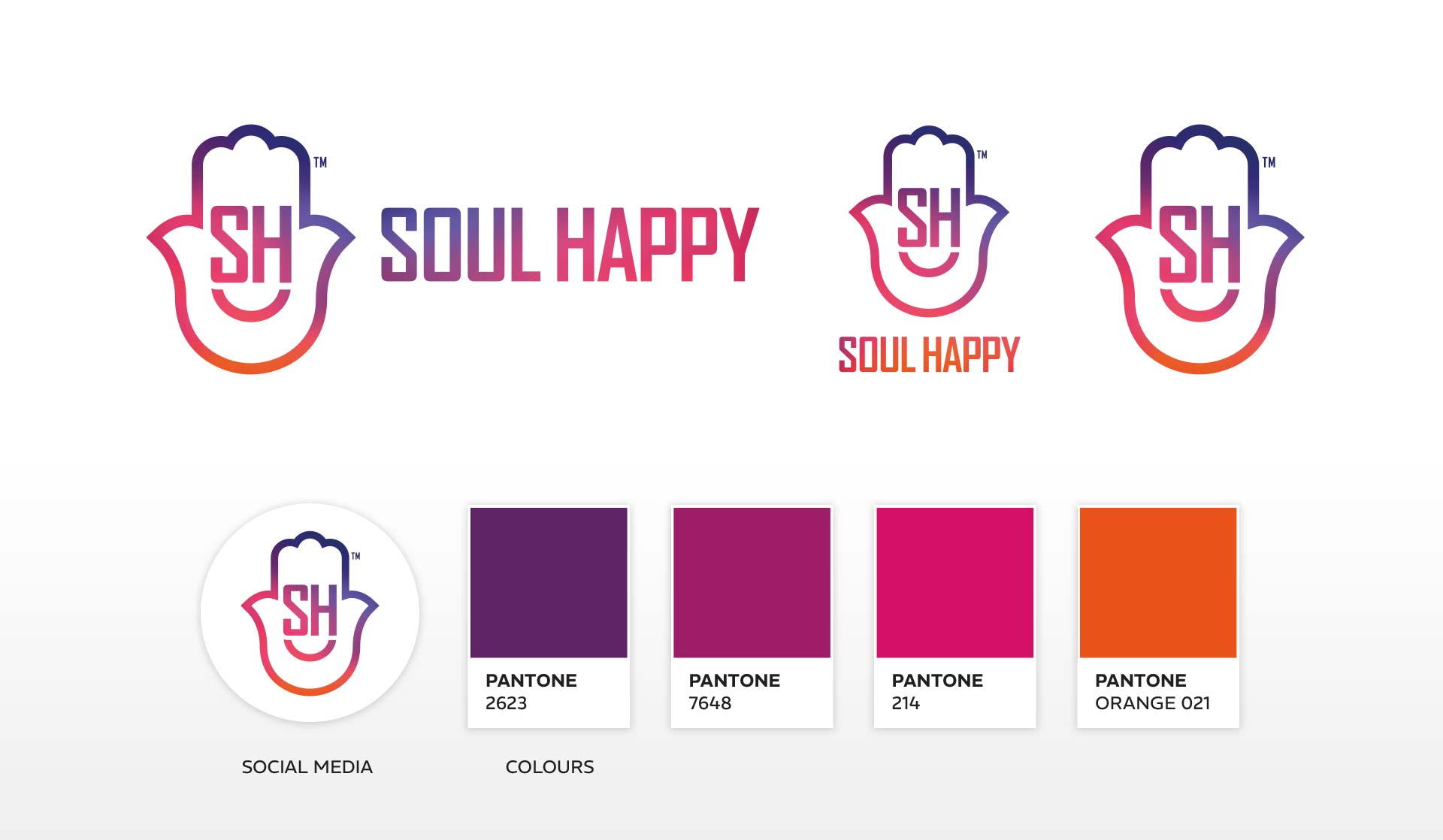
The logo design for Soul Happy features a hamsa hand, geometric typeface, and friendly smile to enhance the connection between the logo, name, audience and what the organisation is all about at its core.
The logo is finished in a blend of colours that represents both the sunrise (a chance to start again) and sunset (time to rest/reset). This gives the work depth and meaning that transpires throughout the wider brand identity.

This is the third evolution of the logo design we’ve been tasked with for exhibition company EPL. Each evolution has been designed to reflect a change in ownership for the business which has been running since the 1980s.
This version is the simplest to date, it’s easy to remember and works well in all digital and physical spaces. It can also work in several alternative colours making the design practically bulletproof.


The PlumbCall logo design provides a friendly feel due to the typeface used, whilst the colour gradient informs people of the cold to warm temperature that’s associated with the products and services offered.
The logo has been around since 2011 alongside the most recognised plumbing company vehicle graphics in Peterborough. This features a baby holding a shower head which has been incredibly valuable to the business.

The logo design for Peterborough based Regal Park has been created specifically to communicate trust and authority in a deeply crowded and competitive market.
In addition to the company logo design, we originated the Regal Park name along with many other branded items for the ever growing business.

Another example of a logo design that has stood the test of time. Sensation Creative’s logo design for Serenity Loves combines elegance, authority and tranquillity due to the typestyles and colour choices.
This makes it a perfect fit with the name and nature of the beauty business which continues to thrive with a loyal Peterborough customer base.
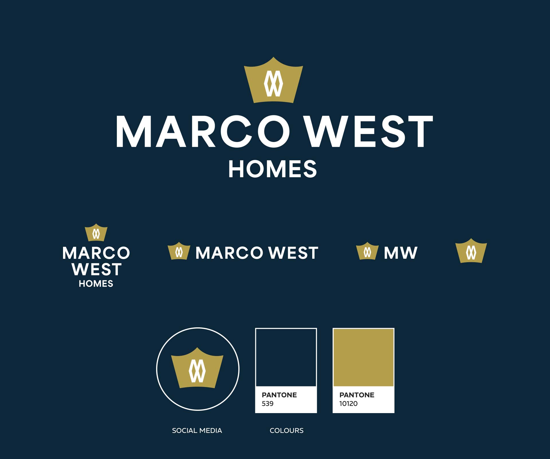
The design for the Marco West Homes logo suite and name origination is the result of a strategic approach to the brand design process. This approach is the most effective way to create a brand identity as it takes a deep dive into defining the brand prior to design work taking place.
This project is well worth looking into in more detail if you want to find out how our process removes unnecessary guesswork from logo design projects whilst helping to create unique brand identities that connect with people at a deeper, humanistic level.

The One Word Graphics logo fuses elements together. The number ‘1’ combines with the letter ‘W’ to create a single graphic and a clever play on the name: One Word - Graphics, one graphic - the logo symbol.
The logo design is part of a larger project that also saw a redesign of the website and other items. Since the rebrand, the company has gone on to become Peterborough’s premier large format print specialist.
Largely due to the way our brain decodes imagery and remembers information, making complex simple is one of the key tasks a design agency faces when designing a company logo.
This, along with design that is relevant and unique, are key qualities associated with good logo design.
Elements we consider as part of a logo design include a logo symbol or logo device, logo typeface, and colour palettes, all of which should connect to the business.
Logos that are well designed often include one clever design element that helps to make it unique and memorable. This could be a modified typeface, unique symbol, name, colour, or a combination of some or all these things.
Logos need to be responsive in nature. This means that they can function in all environments without loss of recognition or legibility, from social media profile images and upwards, like in the examples above.
Logo design consistency is key. If you have variations of a logo like in a responsive logo suite for example, consideration is required in the design to preserve consistency.
If your current logo does not meet these basic standards, or if you are thinking about having a new or updated logo design, contact us. Together we can create an incredible logo for your business that stands the test of time.

I’m here to help take your brand from where it is now to where you want it to be. My approach connects your brand with people on a deeper, more human level, ensuring that we reduce risk and maximise reward. If you like what you've seen and have a project in mind, let’s chat! I’d love to hear your ideas and explore how we can work together.
Discovery & Research
Strategy
Brand Identity
Positioning
Brand Development & Rebranding
Logo & ID Systems
Brand Style Guides
Brand Messaging
Collateral, Print & Packaging
Wayfinding & Signage
Exhibition & Environmental Design
Fleet Vehicle Graphics
Iconography
Website Audits
Website Design & Development
Search Engine Optimisation
Bespoke Content Management Systems
Website Hosting
Pay Per Click Advertisements
Email Template Design
Photography
Videography
Copywriting

