
Download Your FREE Brand Audit - 
CLICK HERE
Sensation Logo
Sensation Logo
Sensation Logo
Curo IP Brand and Identity Design by Sensation Creative

Curo IP

Telecommunications
Brand Identity Design: Responsive Logo Design Suite. Logo User Guidelines. Website Concepts. Company Brochure.
Iconography. Data Sheets. Ad Concepts. Photographic Retouching.

The Problem:
Curo IP launched in 2020 with a brand identity that suited an early stage business finding its footing. But as the platform evolved into a more sophisticated communications provider, the original identity couldn’t keep pace. It no longer reflected the company, and it lacked the coherence needed to support wider recognition in a competitive market.
The Solution:
To align the brand with where Curo IP is now and where it’s heading, the identity was rebuilt with clarity, consistency and long term scalability in mind. The refreshed identity system expresses the company’s strengths, supports expansion into new markets and delivers a visual language that feels confident and ready for its next stage of growth.

A new logo designed for clarity, consistency and long-term scalability

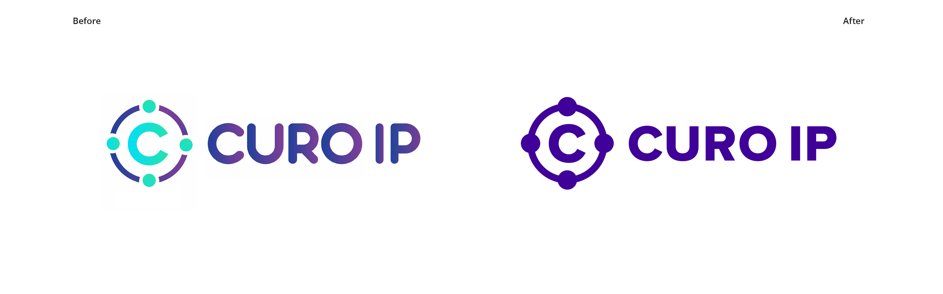
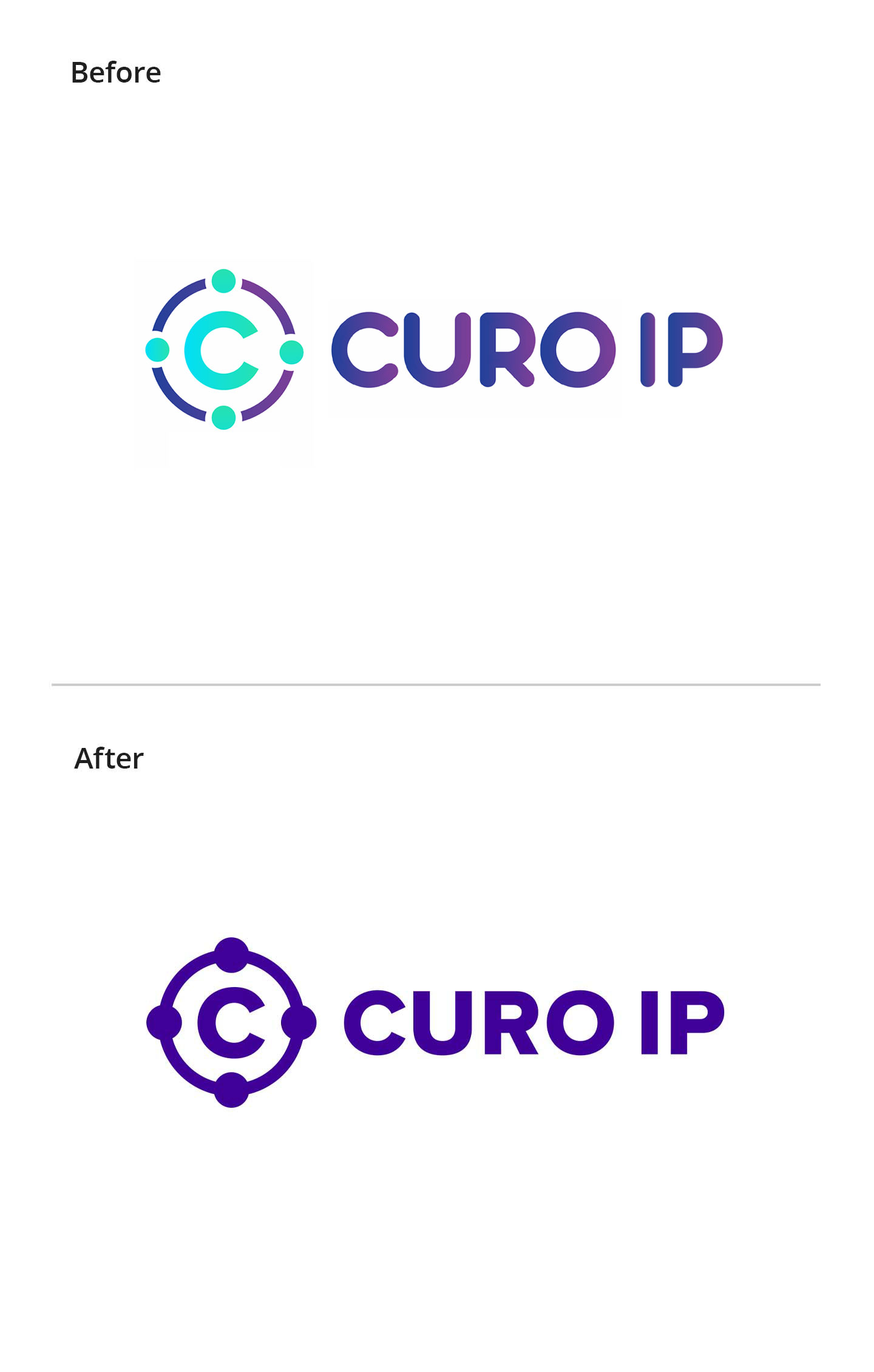
Curo IP logo before and after comparisonCuro IP logo before and after comparison
Before: Curo IP’s existing logo was fragmented. It comprised of mismatched fonts and lacked consistency between the symbol and logotype. The colour palette needed refinement to work more effectively as a logo and as part of the wider brand identity system.
After: I unified the conflicting fonts by switching to Proxima Nova Extra Bold, resolving the inconsistency between the symbol and logotype. The symbol’s sharp outer points have been removed and connected into a clean circular outline, simplifying the mark and reinforcing the idea of connectivity.
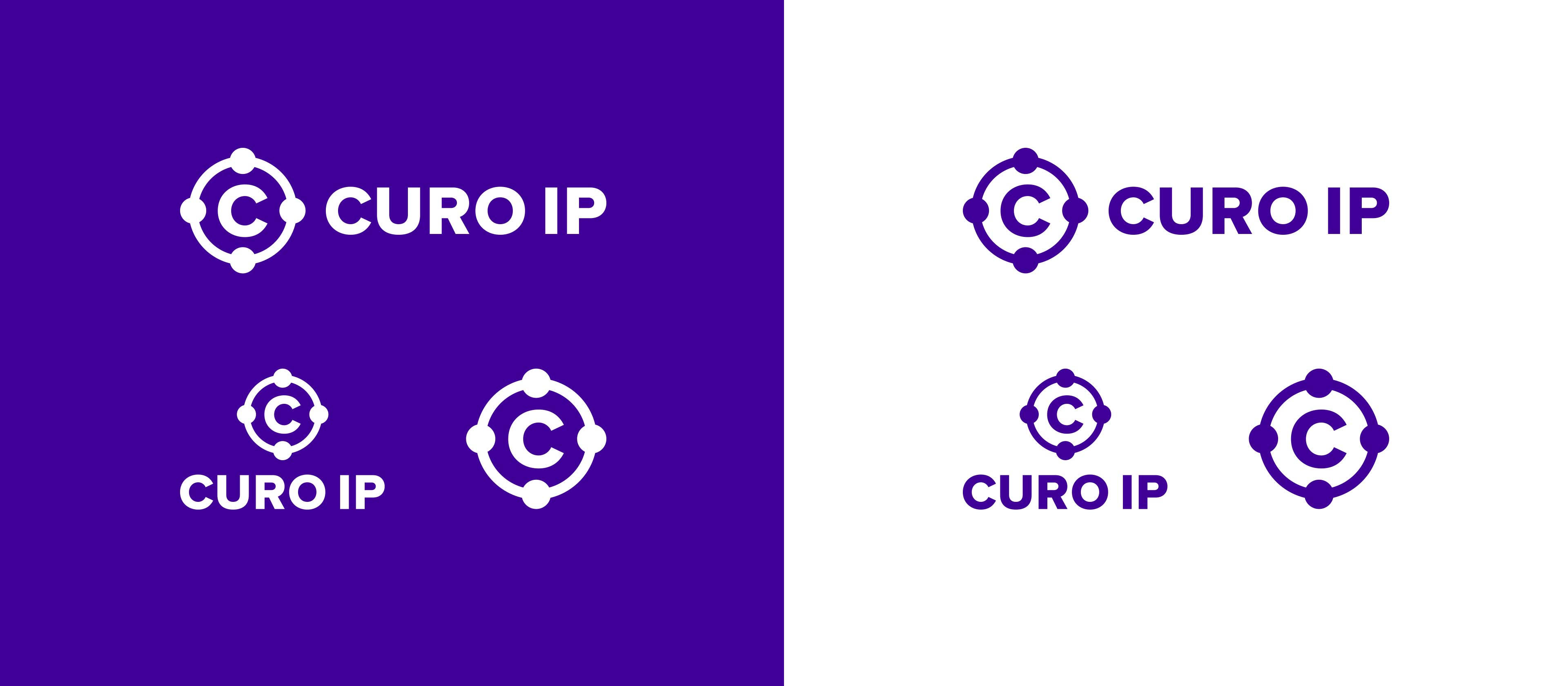
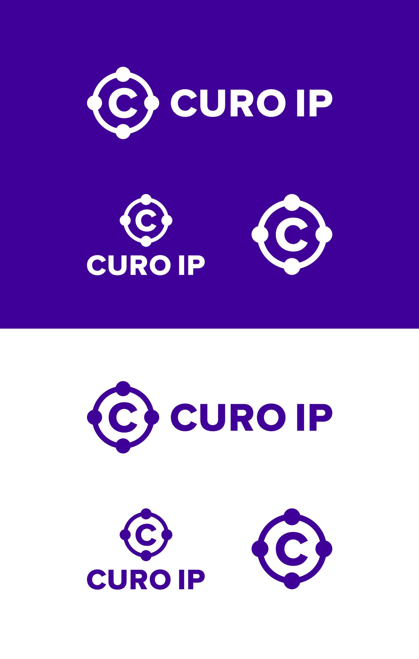
Curo IP Logo SuiteCuro IP Logo Suite
I developed a responsive logo suite for Curo IP. It’s designed to maintain clarity, legibility and brand recognition across a full range of applications. This is essential for brands that need to remain consistent and recognisable at every touchpoint.
From digital platforms like websites and social media to printed collateral, products and packaging, the variations ensure the logo works effectively without losing impact or instant recognition. This is a must for today’s logos.

Developing the wider brand identity system:
Typeface & Fonts

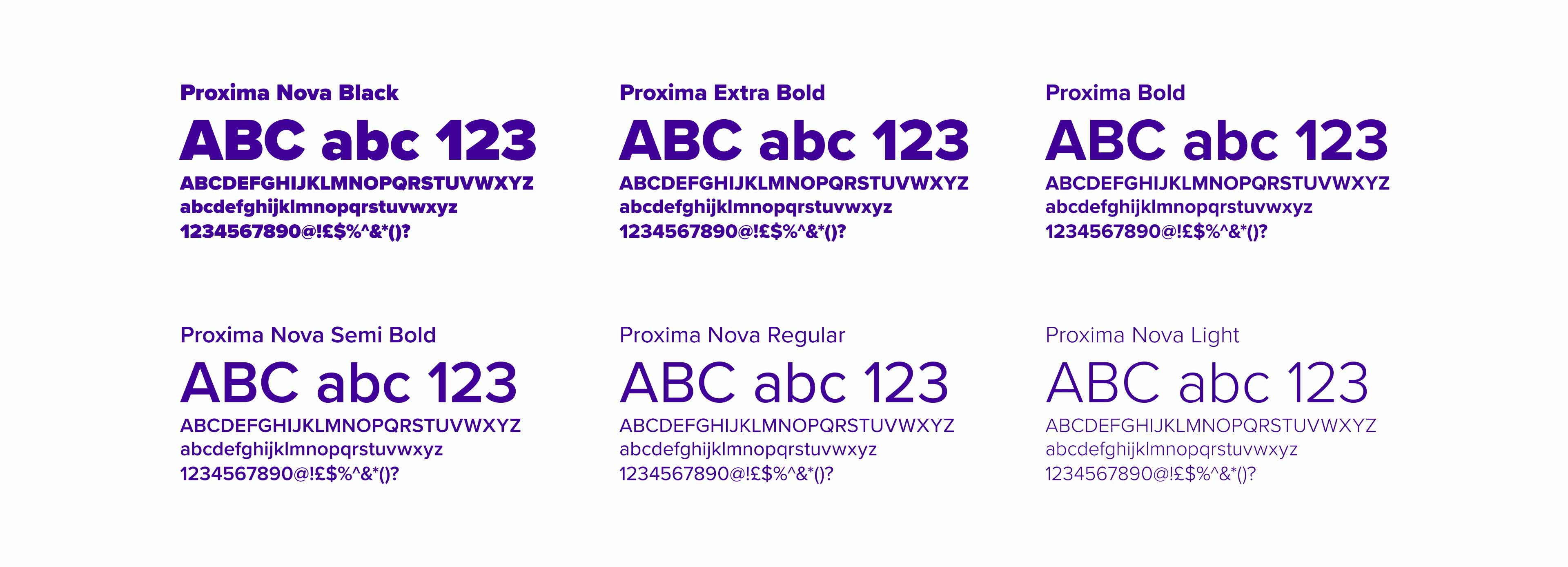
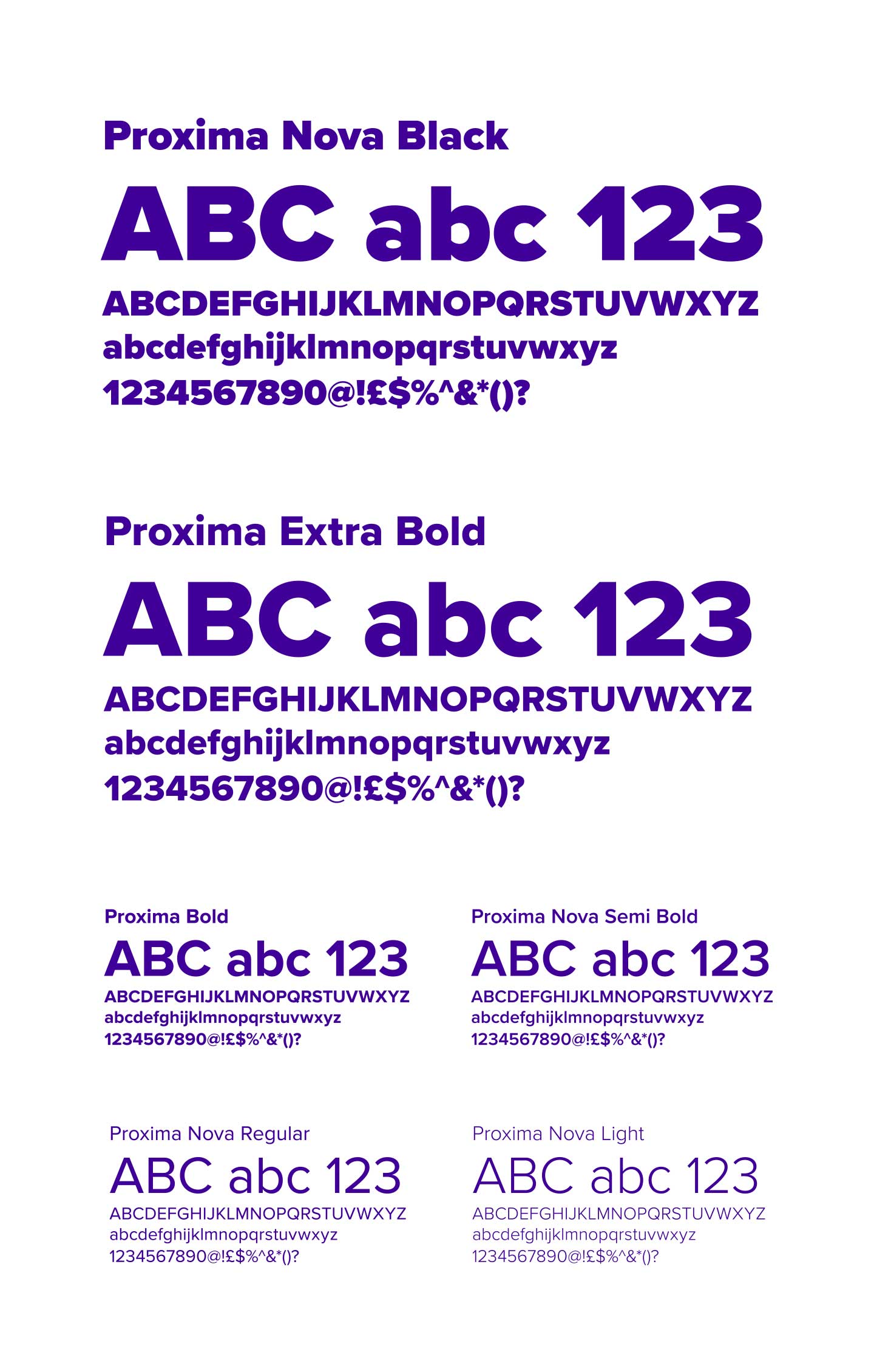
Curo IP FontsCuro IP Fonts
To support the brand’s modern, approachable feel, I selected Proxima Nova as the primary typeface. Its clean lines and geometric balance offer clarity and structure, while subtle humanist details bring warmth and accessibility.
With a wide range of weights, it work confidently across digital and print: from bold headlines to fine print details, helping the brand stay consistent and legible at every touchpoint.

Colour

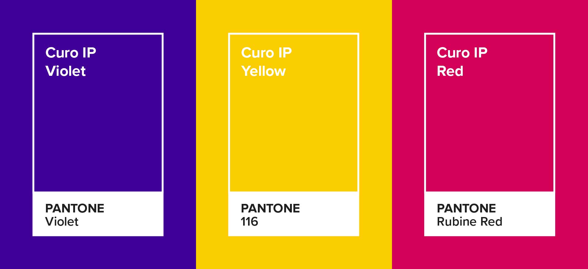
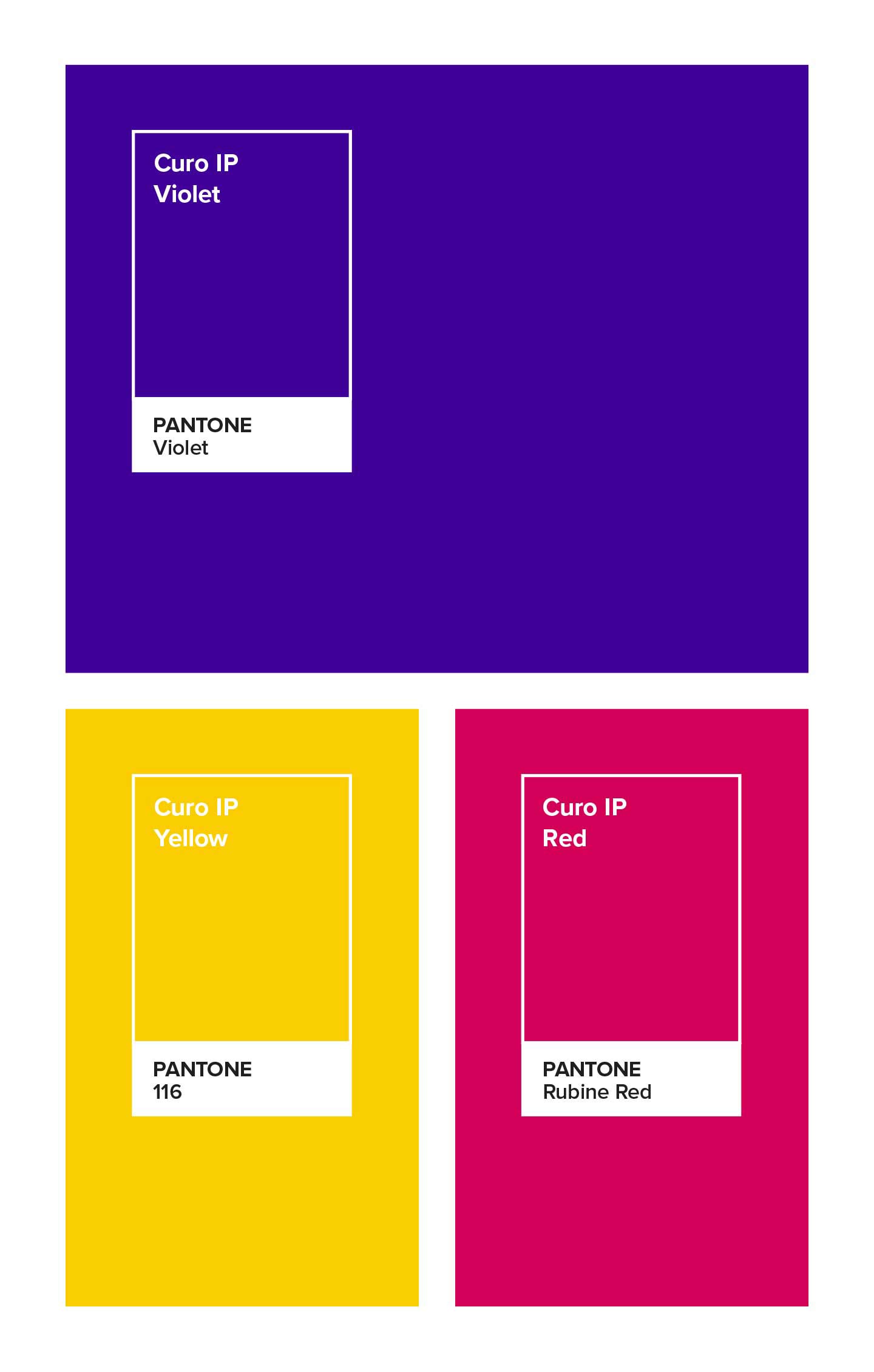
Brand Identity colours by Sensation CreativeBrand Identity colours by Sensation Creative
The new vibrant colour palette brings energy, emotion and standout personality to a brand, helping it to feel dynamic, memorable and visually distinctive. Perfect for the industry that Curo IP occupies.
Here’s what the colours are commonly associated with:
Violet (primary colour): inspires, motivates, uplifts
Yellow: joy, optimism, warmth.
Rubine Red: passion, power, energy.

Iconography

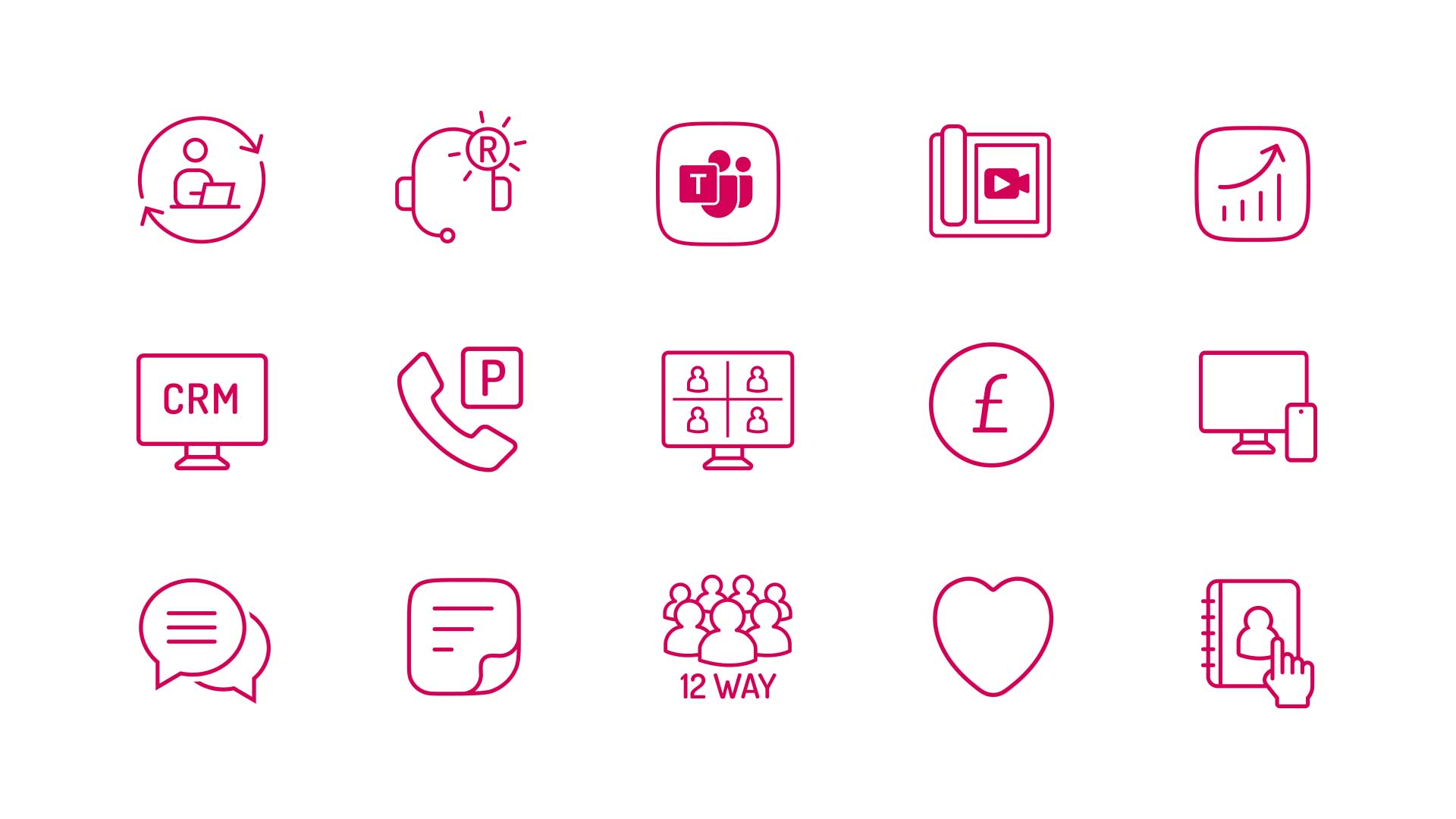
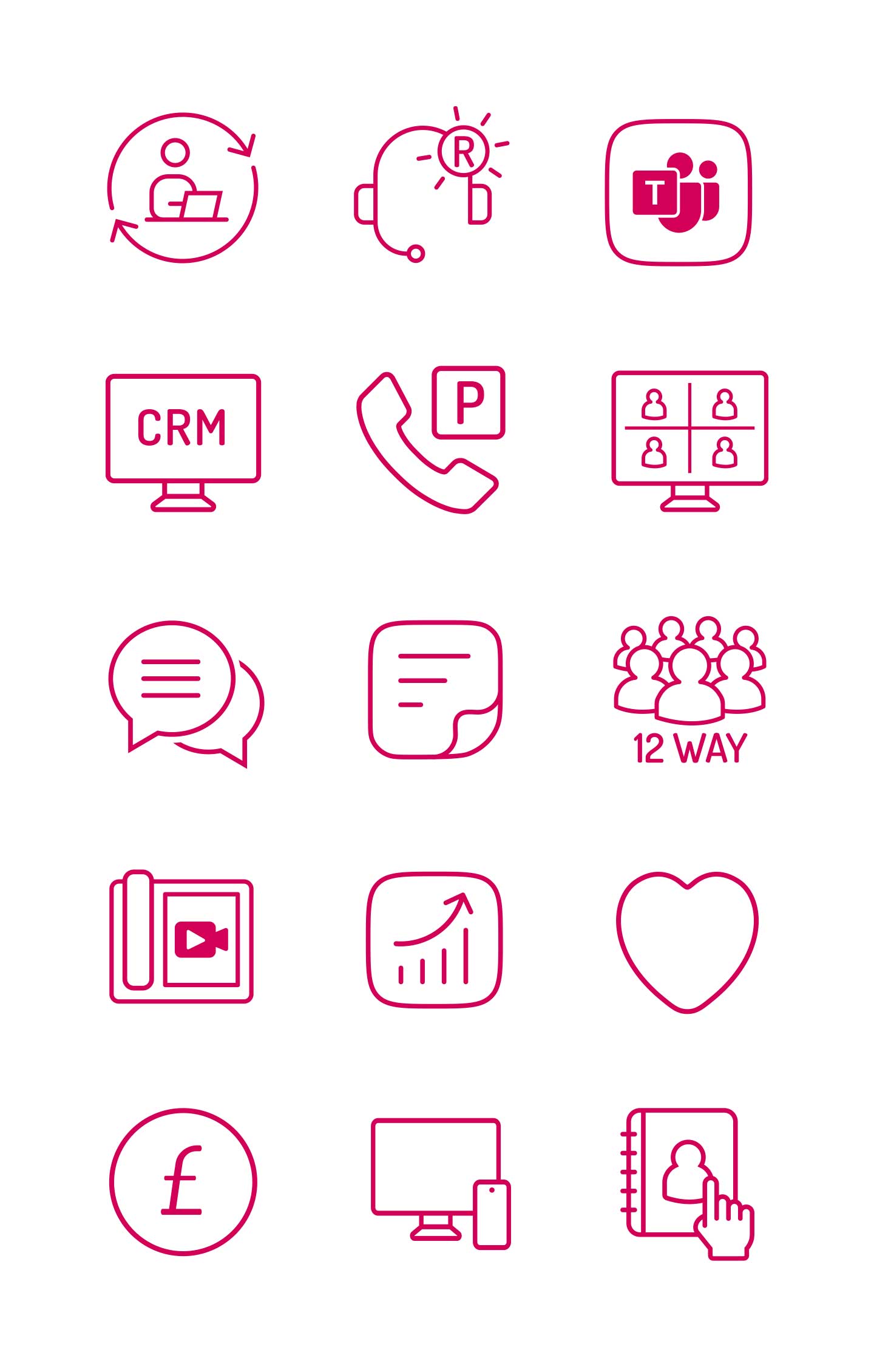
Curo IP Icons by Sensation CreativeCuro IP Icons by Sensation Creative
A new library has been developed for Curo IP to establish a consistent visual language across product and marketing touchpoints.
The icons work to help distil complex ideas into simple visual cues, making information easier to scan and navigate, especially across digital interfaces.

Image Assets

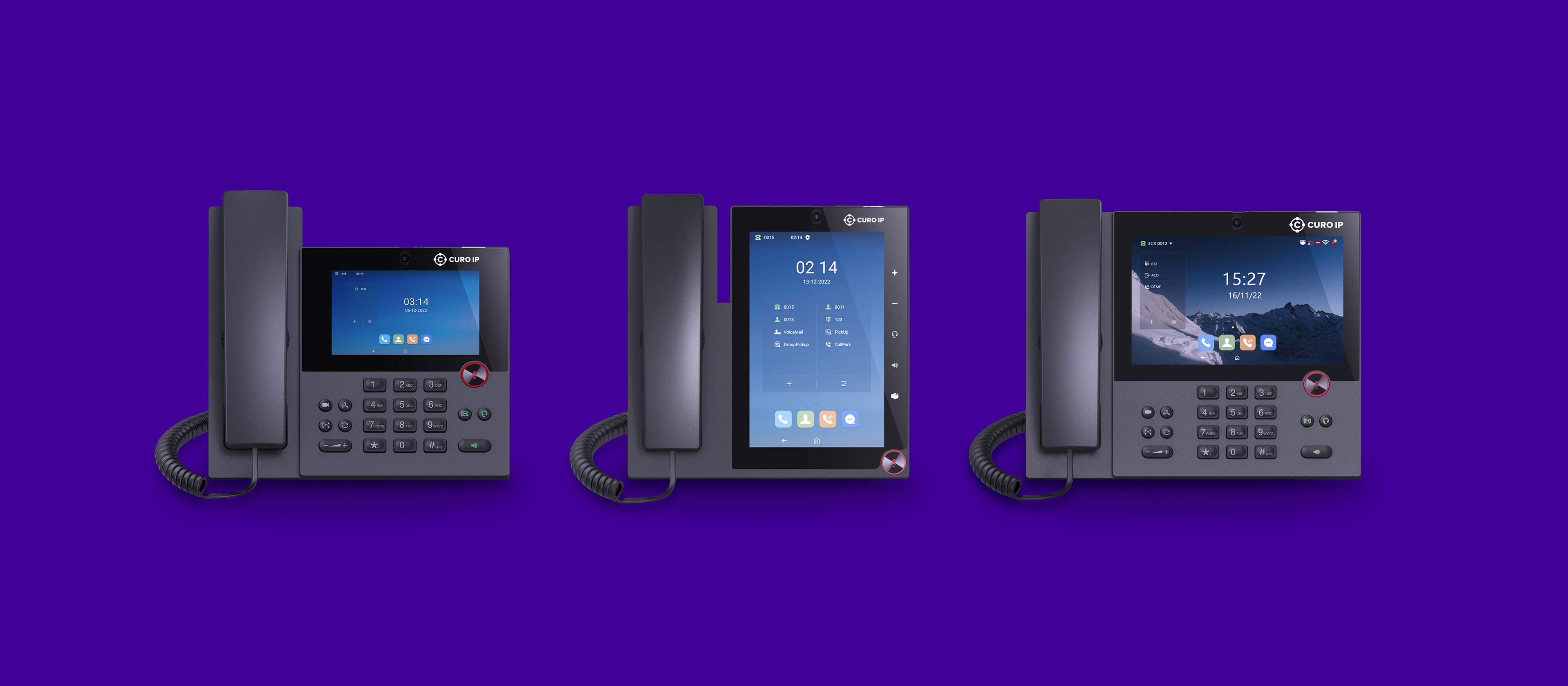
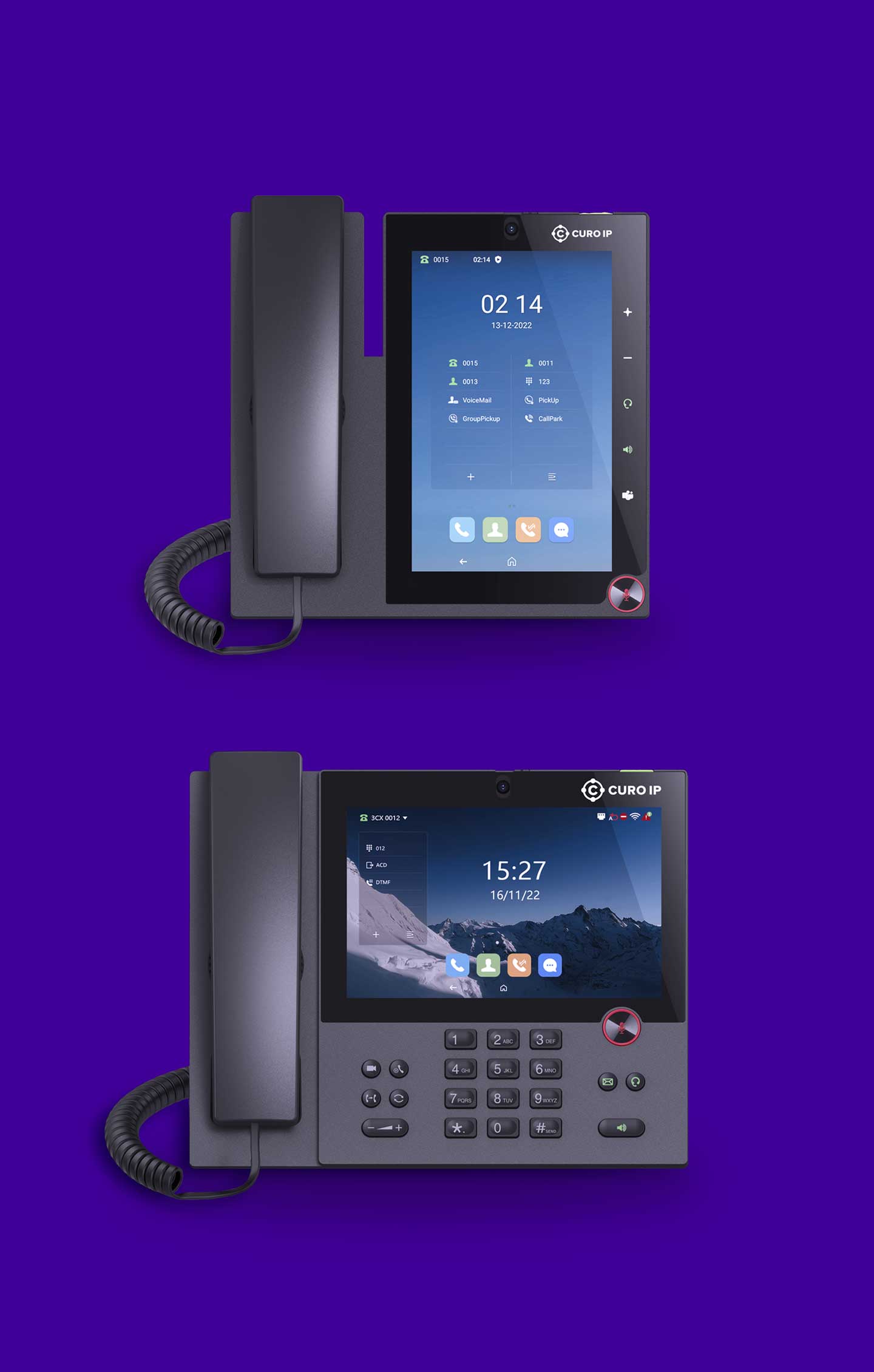
Curo IP Brand Identity PhonesCuro IP Brand Identity Phones
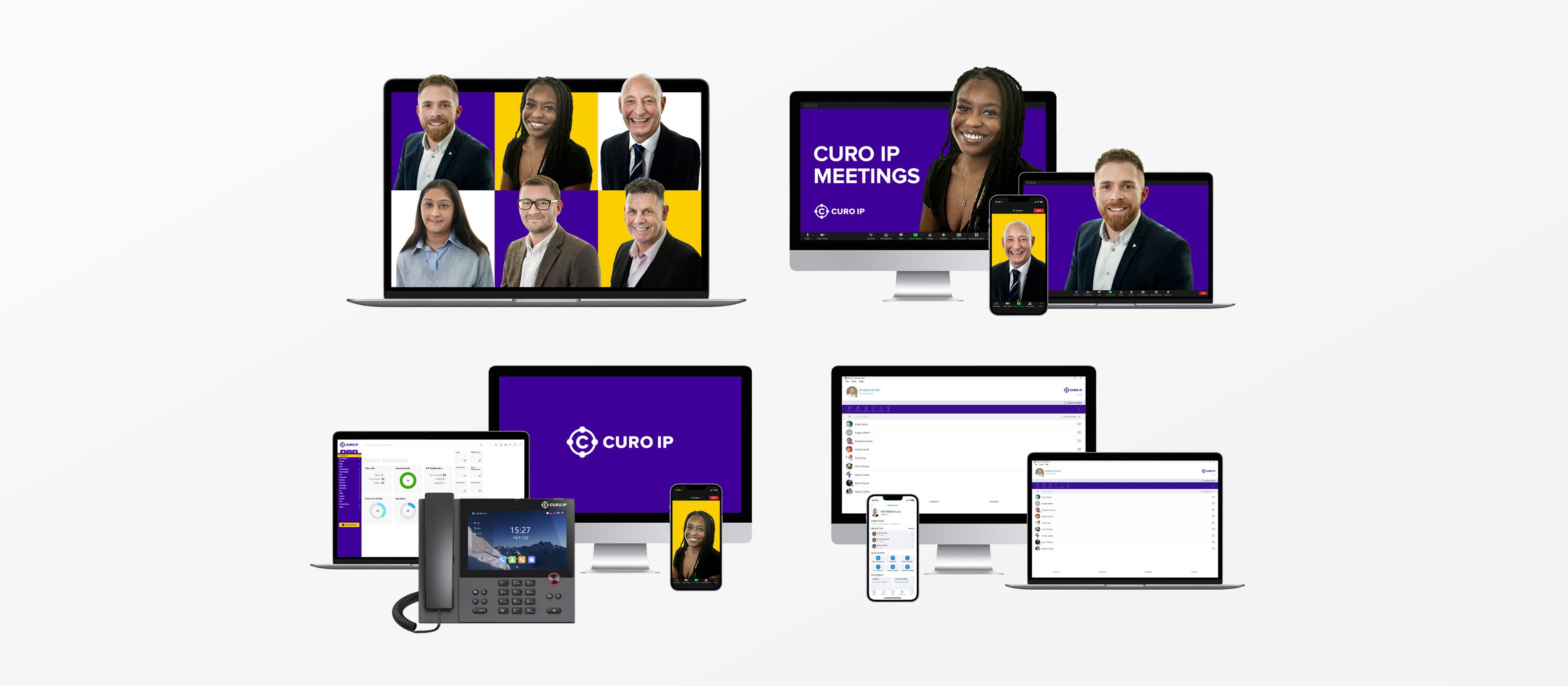
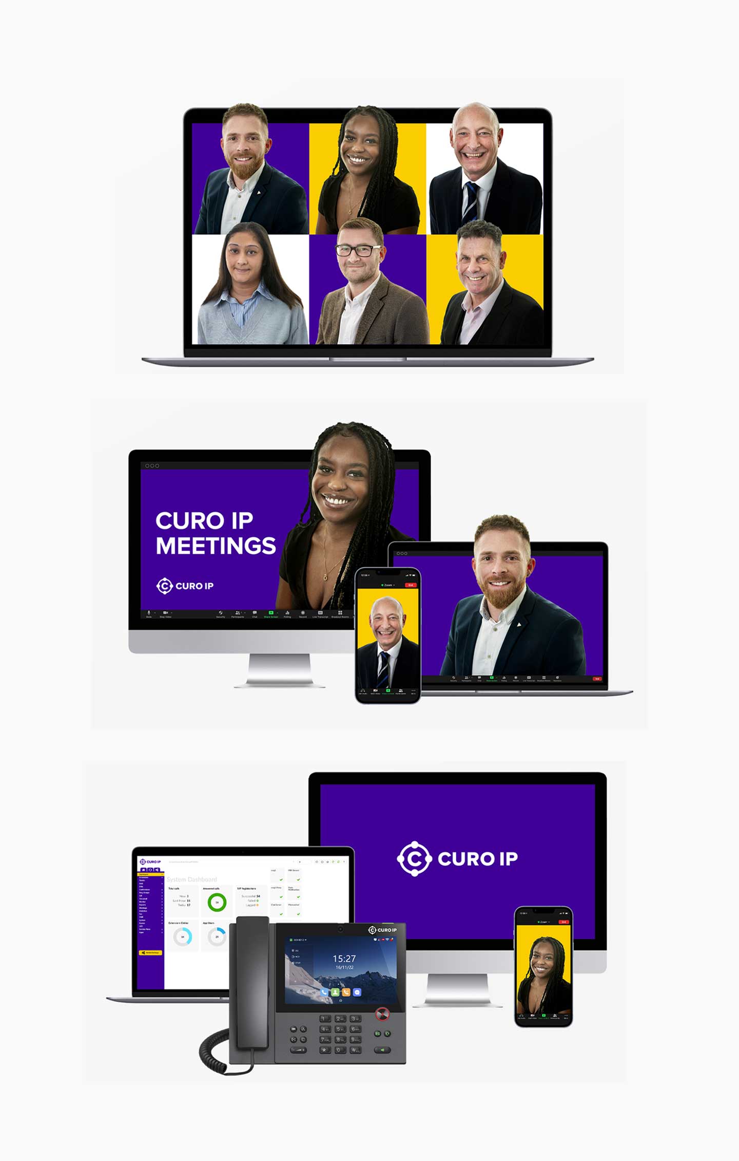
Design Assets for Curo IP by Sensation CreativeDesign Assets for Curo IP by Sensation Creative
Curo IP’s image assets have been designed to enhance the brand’s visual identity while conveying its core values and product benefits.
The assets create a consistent look and feel across digital and print channels, strengthening recognition and enhancing the way the brand identity is experienced.

The Brand in Action

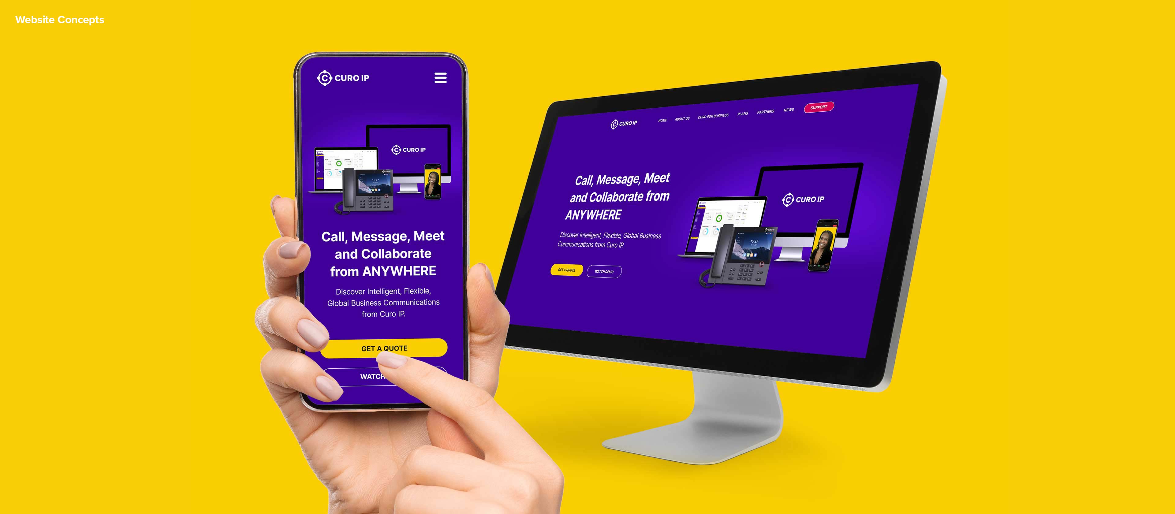
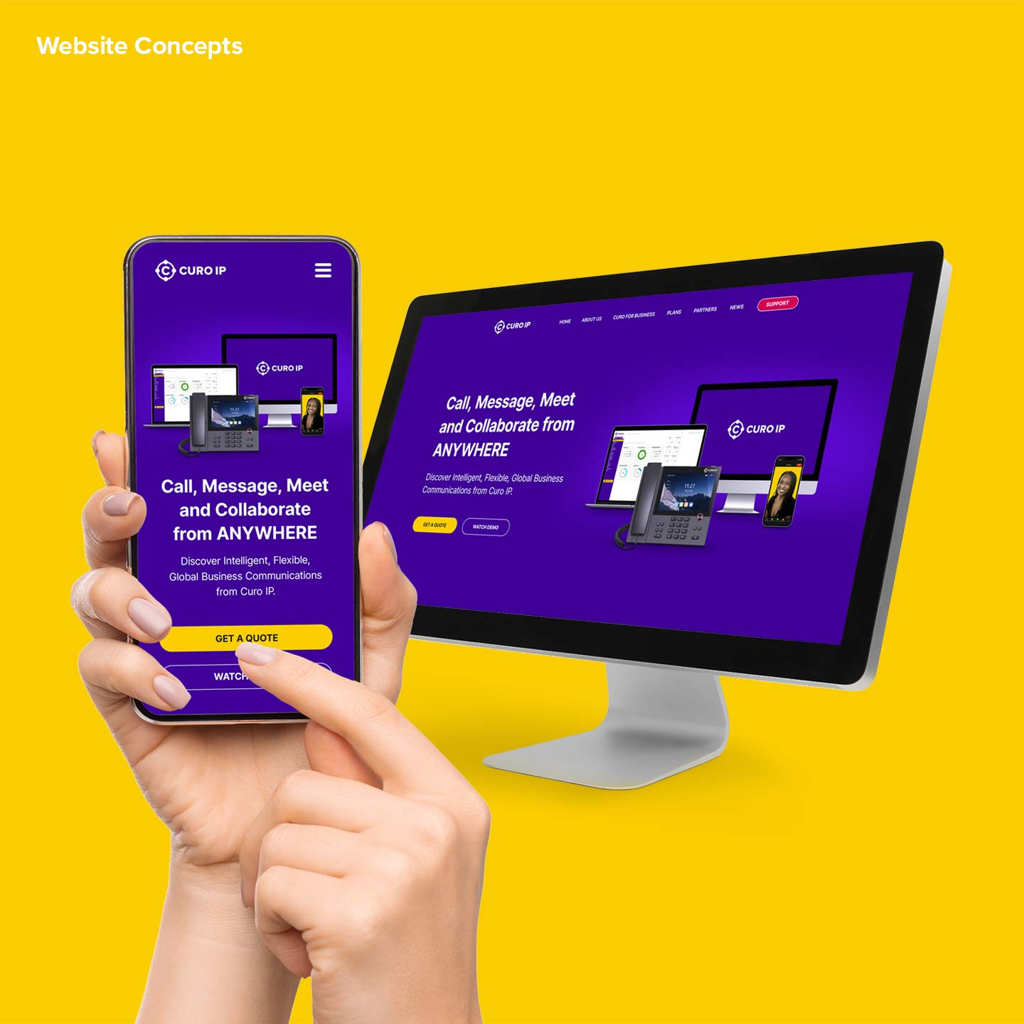
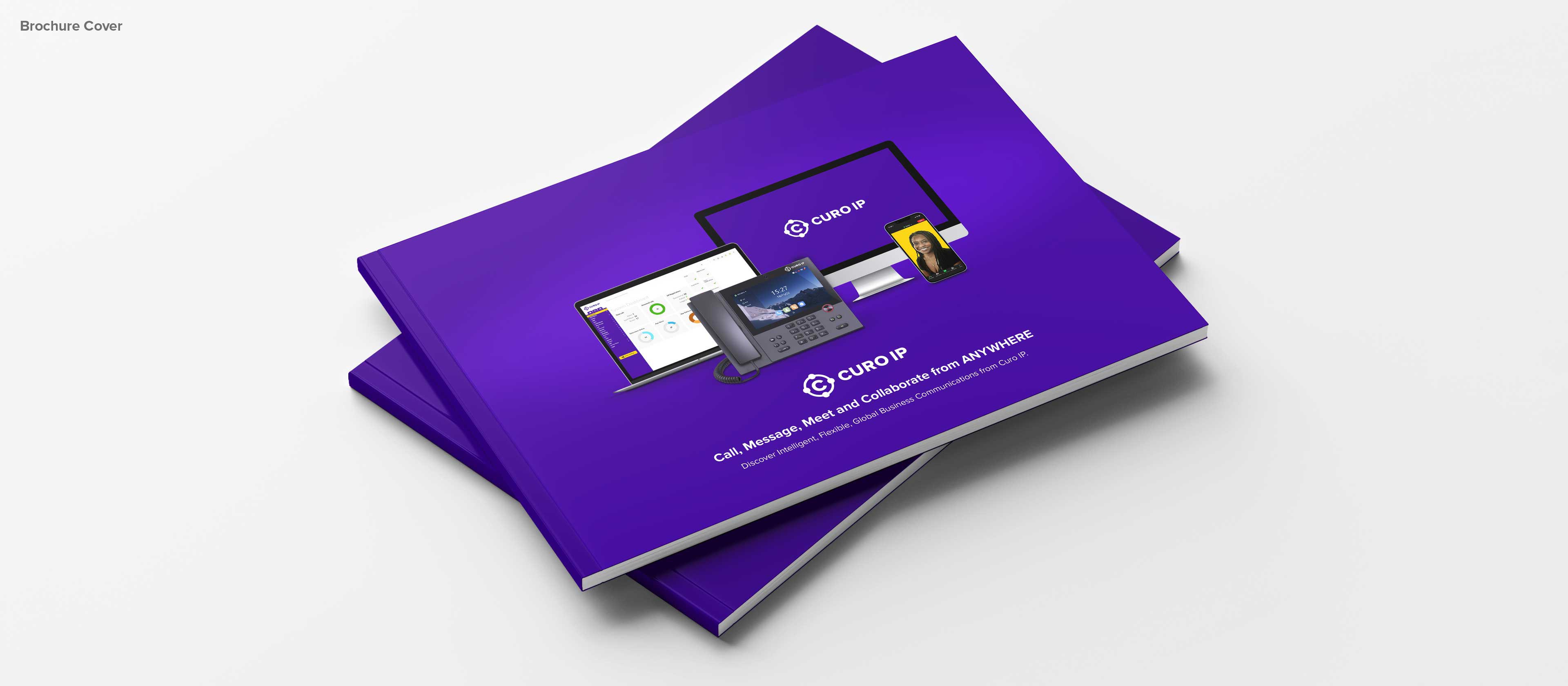
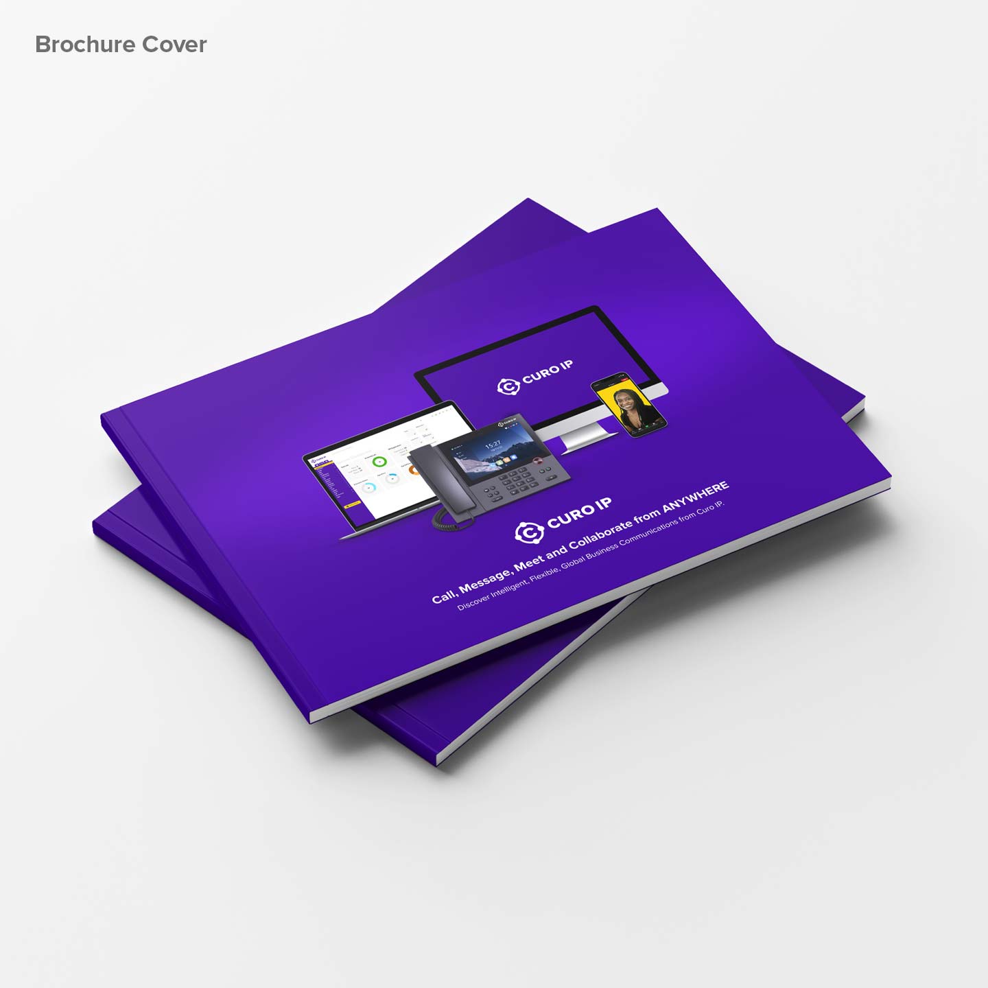
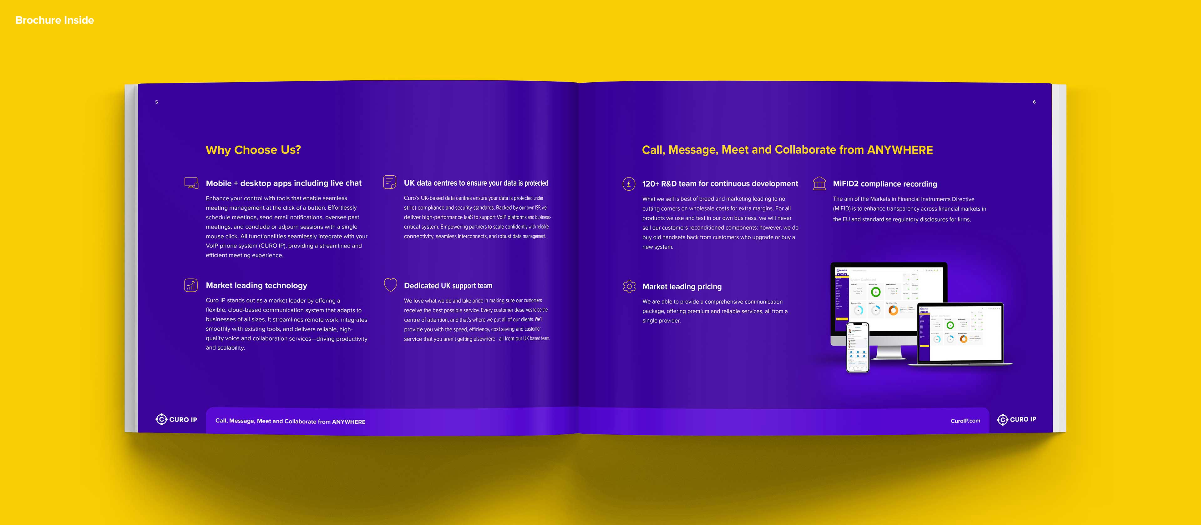
Let’s look at a few examples of how Curo IP’s identity comes to life using the elements that have been designed, from website concepts through to business literature, social and ad design.
Curo IP Website Design by Sensation CreativeCuro IP Website Design by Sensation Creative
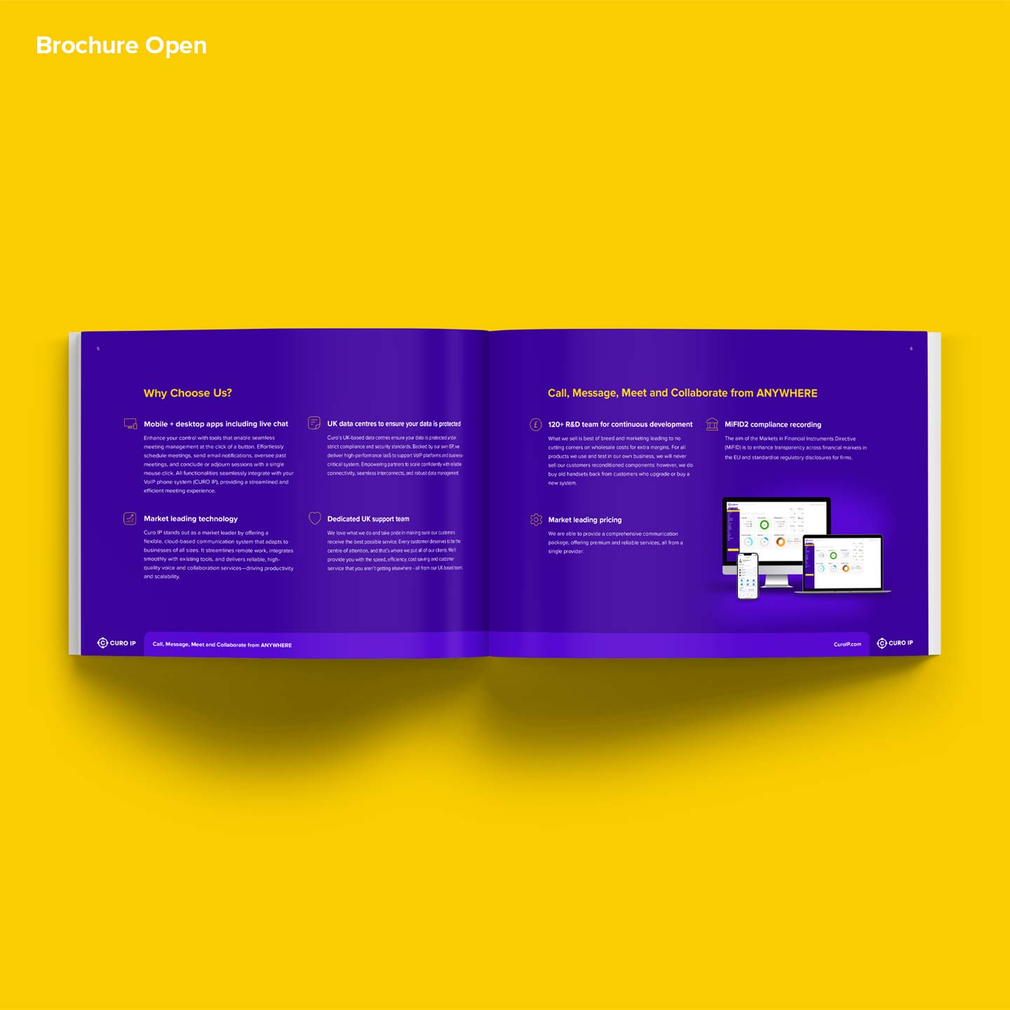
Curo IP brochure designed by Sensation CreativeCuro IP brochure designed by Sensation Creative
Curo IP brochure design contentsCuro IP brochure design contents
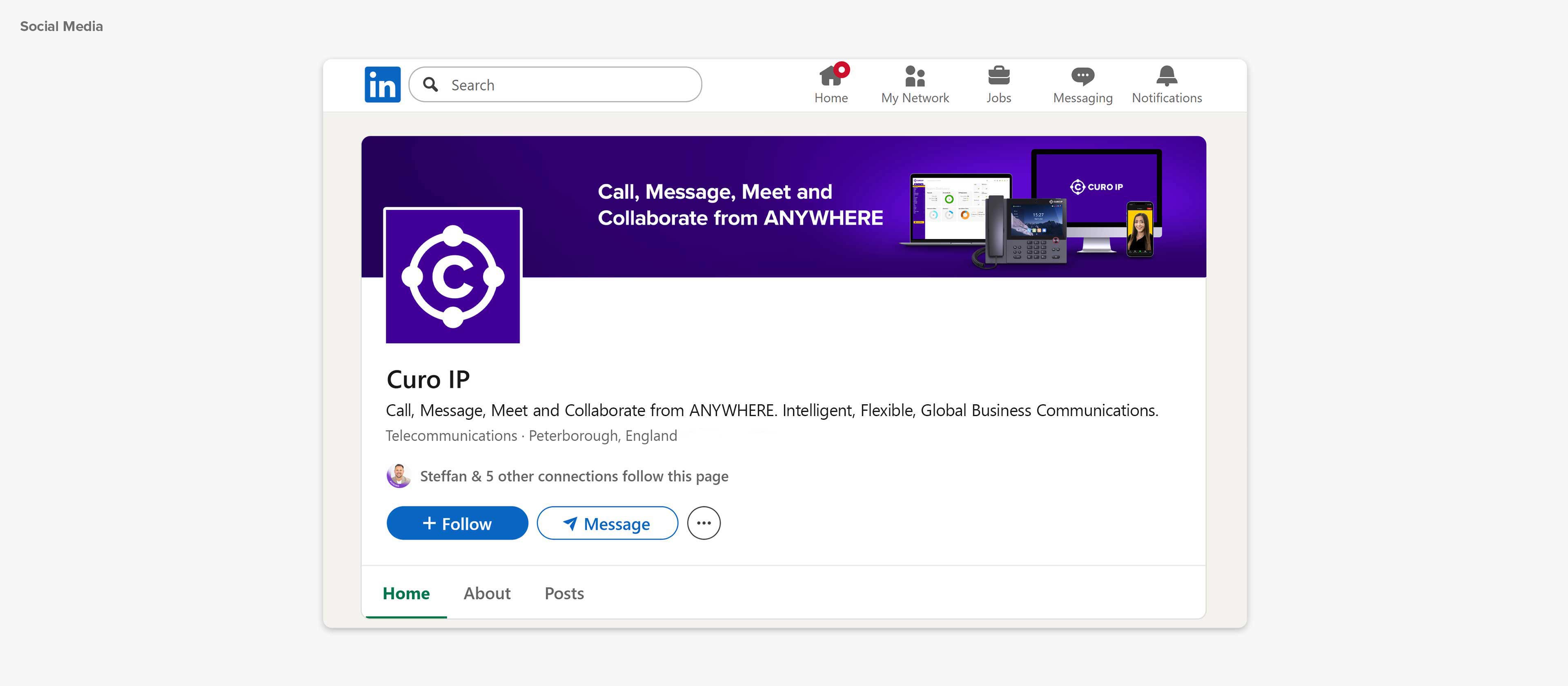
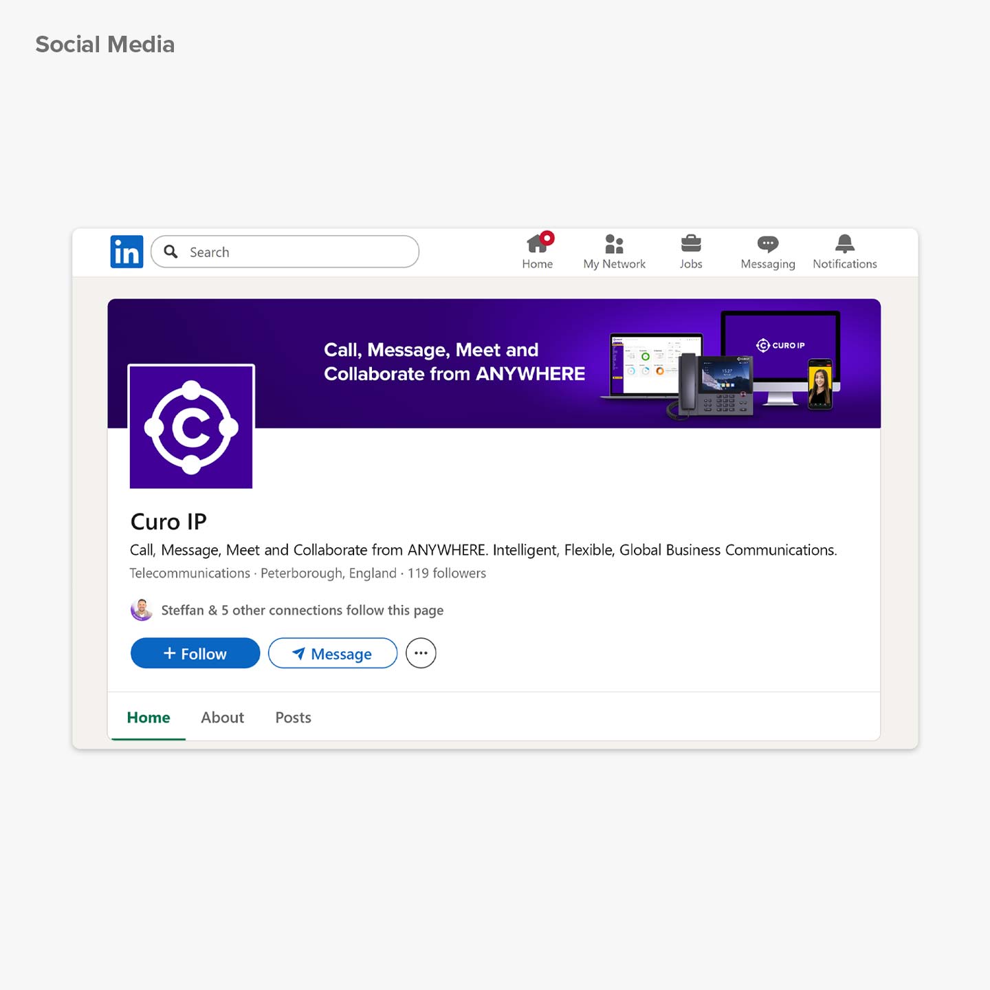
Curo IP Social Media graphicsCuro IP Social Media graphics
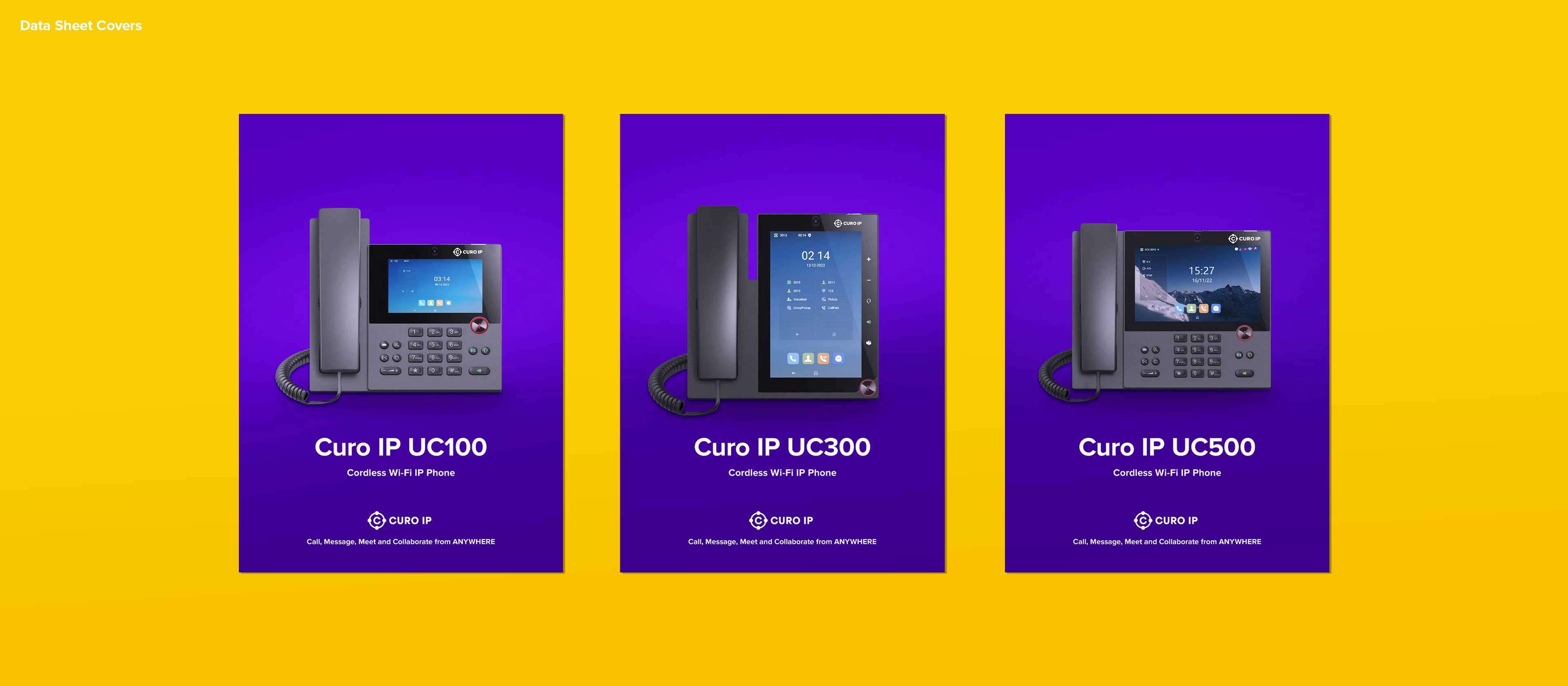
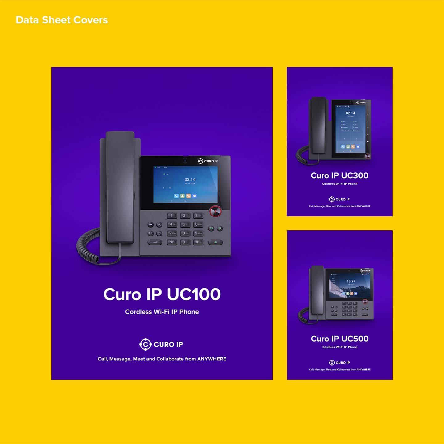
Curo IP Action. Data Sheet DesignsCuro IP Action. Data Sheet Designs
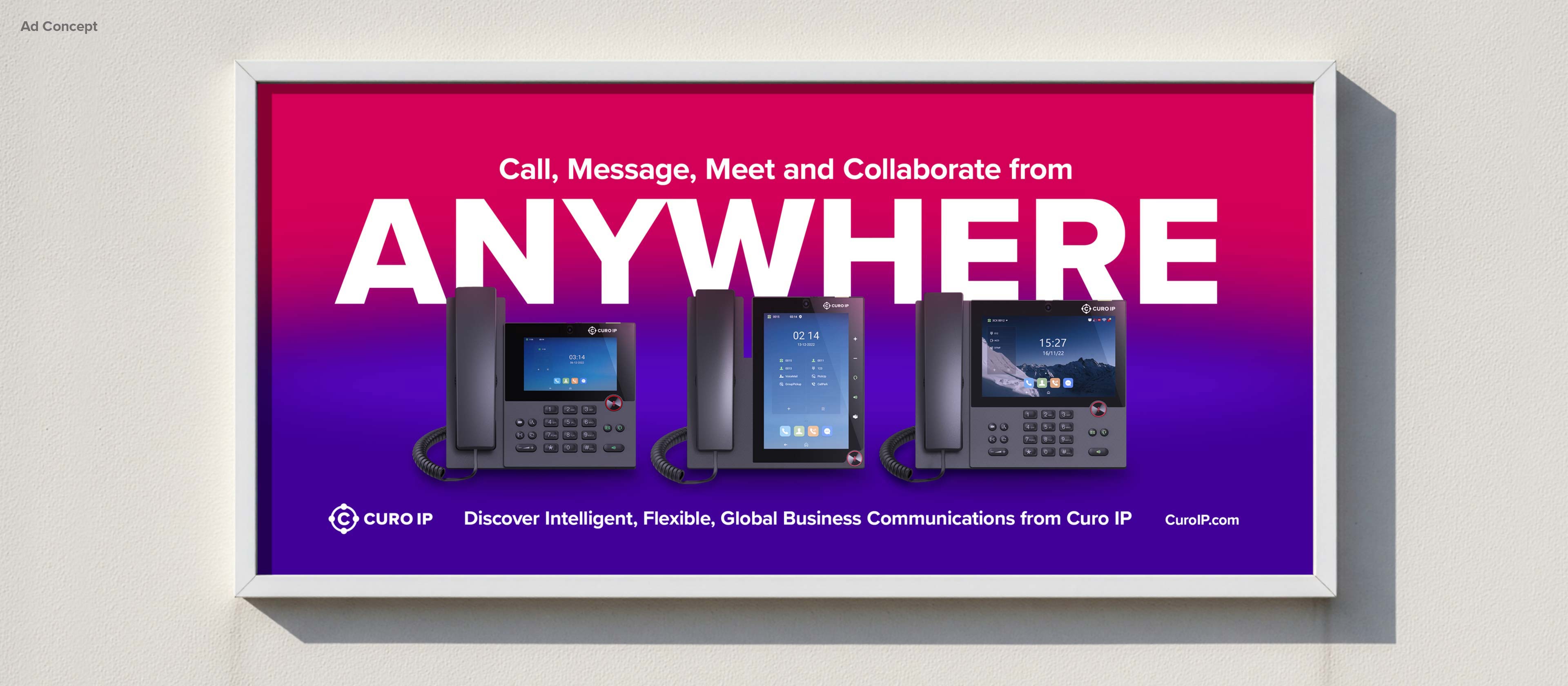
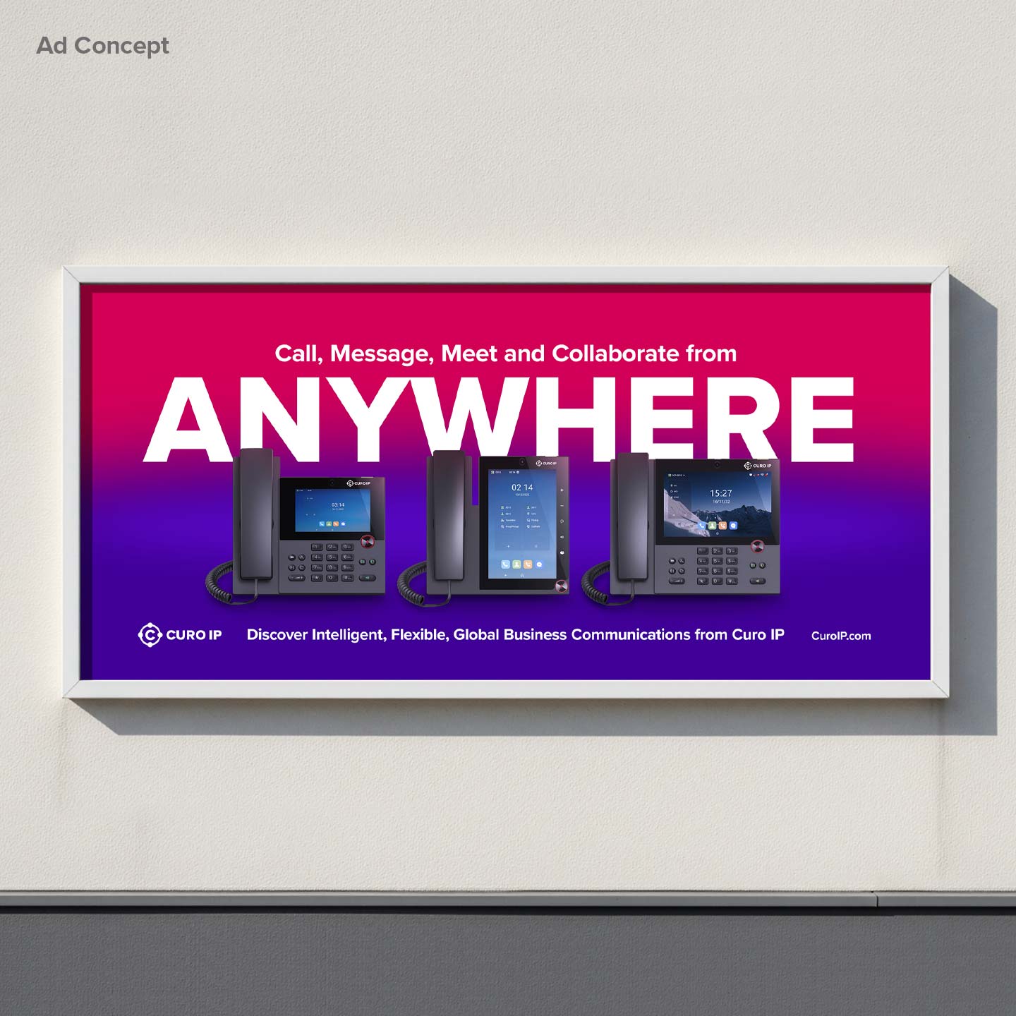
Advert Concept by Sensation CreativeAdvert Concept by Sensation Creative

Feedback

“From the start, Simon showed a clear understanding of what we needed for our rebrand. We had our initial meeting to discuss our needs and ideas. We talked about our marketing philosophy, how we view our brand, and how we want it to be viewed. Simon was very open to suggestions and carefully listened to us.
He understood what we were aiming for and 100% produced work that matched our goals. I highly recommend Simon to anyone looking to freshen up (or completely transform) their brand! Now that we have our new, clean, and modern branding, we are suuuper excited for what comes next.”

Greta Naureckyte, Marketing

Final thoughts

Curo IP has evolved far beyond its early stage identity, and the refreshed brand now reflects that maturity with clarity and intent. The new system brings coherence where it was missing, strengthens recognition at every touchpoint and gives the company a visual foundation built for scale.
From the re-engineered logo and responsive suite to the modern typography, vibrant palette, and unified iconography, every element has been crafted to express who Curo IP is today and support where they’re headed next. It’s a brand built to grow, compete and communicate with confidence.
Simon Bell - Brand Expert Peterborough
Hi, I’m Simon - the creative mind behind the work you see here.

I’m here to help take your brand from where it is now to where you want it to be. My approach connects your brand with people on a deeper, more human level, ensuring that we reduce risk and maximise reward. If you like what you've seen and have a project in mind, let’s chat! I’d love to hear your ideas and explore how we can work together.

Get in touch

More projects

Polished London

Irresistibly White! Designing a luxury teeth whitening and oral care brand from inception.

Polished London
Cosmetics
Rydal Group brand design by Sensation Creative

Re-branding one of the UK’s leading communications, managed IT, utilities and security businesses.

Rydal Group
Unified business communications
Optimum Lettings

Optimum branding and over ten years of design and communications support.

Optimum
Estate & Letting Agent
Marco West Case Study

Powerful brand strategy for building company Marco West Homes.

Marco West
Housing Development
Sense Aroma graphic design by Sensation Creative

Consulting, package design, photographic retouching.

Sense Aroma
Wellness & Lifestyle
Regal Park

Discover how we built this award winning property company brand from the ground up.

Regal Park
Estate & Letting Agent
EPL

A creative partnership: from brand design through to designing for blue chip clients.

EPL
Exhibition Design & Build
Nosey Barker

Developing a dog training brand to create a consistent look across all touch points.

Nosey Barker
Dog & Puppy Trainer
One Word Graphics

Rebranding featuring new design with a comprehensive website update and rebuild.

One Word Graphics
Sign, Print & Display
Jolliffe Daking LLP

Website design, marketing, internal and external service communications.

Jolliffe Daking
Estate & Letting Agent